What’s in/on a Cover?
- Anke Schwittay

- Jan 20, 2021
- 3 min read
Updated: Sep 14, 2021
Bristol University Press has asked me to send them some ideas for a possible cover image for my book. This has seen me looking through image banks for the last few days to try and find the perfect image and doing lots of brainstorming with Paul, my more creative half. Needless to say, the perfect image does not exist but it has got me thinking about what I want to say with my cover, what I want people to feel when they look at the book. The book’s title Creative Universities: Reimagining Education in an Age of Global Challenges can of course go in lots of different ways, so I thought I share some of my current ideas to see how they resonate with you, my fellow blog readers. If you need a reminder of what the book is about, the blog’s home page is a good place to start and has hyperlinks to chapter summaries.


From flowers to fractals
My image of the book has for a long time been the photo I myself took early on in the project, of wildflowers growing in front of the cracked concrete wall of a building on Sussex campus. For me, the photo encapsulates the idea of ‘let a thousand flowers bloom,’ of creative forces being able to change things that seem set in stone but are not, of growth, possibility, emergence. I still love this picture, although I am not sure if the quality would be good enough for a cover shot. Keeping with the theme of flowers, I also like daffodils, especially at this time of the year when they are the first sign of spring, hope, awakening, and because there is an unruliness to them, a resilience or courage (keep in mind that the book will be published this September though, if everything goes to plan). And they bring yellow happiness, just like sunflowers, which I also love. And sunflowers got me thinking about fractals.


What I like about the three images above is their organic shapes and bold beauty that also convey complexity. They are quite open-ended and thereby invite the viewer’s/reader’s imagination to project unto the image what they think creative universities or reimagining education could mean for them. I could imagine a cover with an image similar to the ones above that grabs people’s attention and intrigues them. But would it be too abstract, too vague? From there, the journey somehow led to architecture.
Being grounded


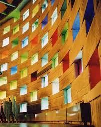
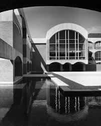
I like the first of the three images above because of its combination of fractals and blue sky thinking. The other two photos are from Sussex university, which is my academic location, the ground I stand on and write from as most of the examples in the book draw on my own and my colleagues’ teaching. As I wrote in a previous post, the university and its architecture have a particular history and these photos might evoke particular associations – of radicalness, modernism, access to university education – at least in UK audiences familiar with this context. But what about international readers or those who would not recognize the buildings? And where are the people, the students and staff who are a university much more than its buildings?
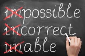
Old school
And then there is a last set of images that I came across on the image banks, of different messages written on blackboards. I like the old-school style of the chalk and blackboard, combined with the messages that speak to some of the things I am writing about, such as the importance of unlearning. In this day and age, where many books about education will probably be about what Sussex calls ‘the digital pivot,’ would a cover that has an image like this stand out or feel completely anachronistic? My book is not about the shift to online learning, although I am reflecting on the impact of COVID in most of my chapters.


So, four very different sets of images. You can clearly see why I need some help here, so if any of these images resonate with or speak to you, please let me know. If you think any of them would absolutely not work, definitely let me know. My editor and I are looking forward to your thoughts!
Update May 2021
The search is finally over and I am very happy with my final cover design! It’s creative and glob-y (like a globe) and hints at fractals. The text box came with the publisher’s preformatted lay-out, so I tried to make the best of it by making it red and bold. I hope you like the cover.


Comments